Curaleaf International

How we created a unified brand for a fragmented international business

Curaleaf International

About

Launched in 2018 following a major rebrand, Curaleaf International established itself as a major competitor in the global medical cannabis industry. It expanded rapidly through an aggressive buy-and-build acquisition strategy, absorbing established brands across every subsection of the market.

By acquiring companies like EMMAC Life Sciences, Rockshore Laboratories, and Sapphire Medical Clinics, it secured a firm foothold across production, distribution, and medical education.

Each of these entities was then rebranded to fall under a central umbrella, forming Curaleaf Laboratories, Curaleaf Pharmacy, Curaleaf Clinic, and Curaleaf Education, a strategy that enabled rapid scaling within a fiercely competitive market.

The Challenge

Although this strategy was a huge success in capturing significant market share and authority, it resulted in severe brand fragmentation.

Operating across multiple countries and sectors with disjointed visuals, dated website designs, an inaccessible colour palette, and inconsistent messaging caused confusion and distrust among consumers and stakeholders.

Curaleaf came to us to create a definitive baseline brand identity and a modern digital presence. This foundation needed to establish immediate visual cohesion and be easily replicable across their entire portfolio.

Our Solution

To solve Curaleaf’s fragmentation, we developed a two-phase plan. Phase One created a comprehensive Brand Book as the central identity anchor. Phase Two applied this identity to a redesigned, custom-built flagship website for Curaleaf International, giving the brand a modern overhaul and acting as a showcase for all sub-brands to follow.

Phase One: The Master Brand Book

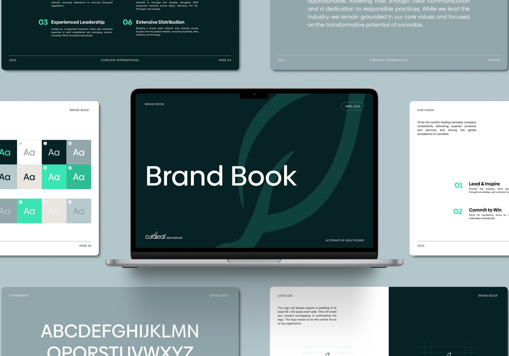
To eliminate differentiation and allow Curaleaf to anchor itself to one cohesive identity, we created a comprehensive Brand Book covering its visual identity, tone of voice, a graphical toolkit, and real-world applications:

Visual Identity

We adapted Curaleaf’s existing assets, updating them to give the brand a more professional, modern look. We standardised rules for logo usage, digital typography, and colour palettes, ensuring everything met WCAG accessibility guidelines.

Tone of Voice

To communicate the brand’s vision, mission, and core values to a multinational audience, we established standardised tone-of-voice guidelines built on four core pillars: trustworthiness, innovation, optimism, and global adaptability.

Operating in a highly regulated and patient-oriented industry means the brand must balance authority and innovation with human empathy. Swaying too far in either direction would result in not being taken seriously by clinicians or failing to resonate with patients on a human level.

Graphic Toolkit

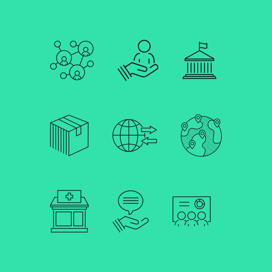
To let Curaleaf apply these guidelines, we created a suite of flexible visual assets including custom textures, gradients, and iconography. This toolkit was built specifically to make it effortless for internal teams to produce new content while staying strictly aligned with the brand.

Along with these visual assets, we outlined dedicated human-centric photography guidelines to bridge the gap between high-tech medical research and patient care.

Brand Applications

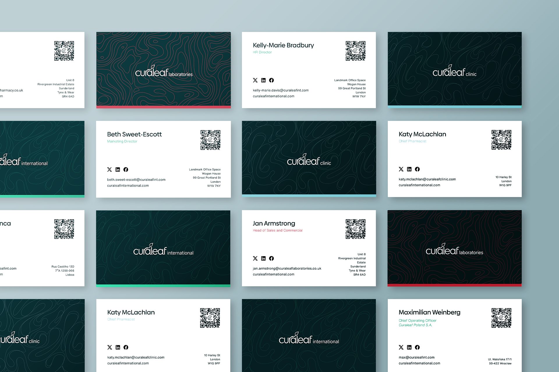
To showcase how the brand exists in practice, we provided real-world examples of the guidelines applied to digital platforms, print collateral, and physical spaces.

Phase Two: Flagship Website Redesign & Rebuild

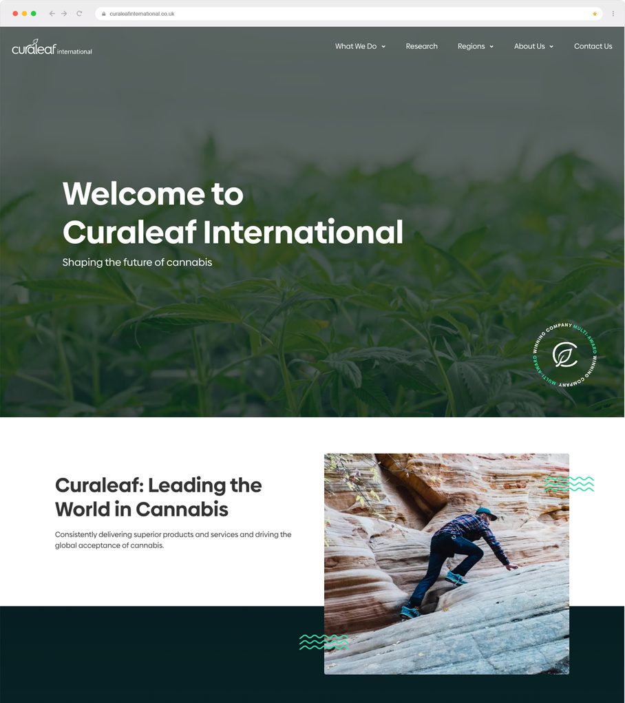
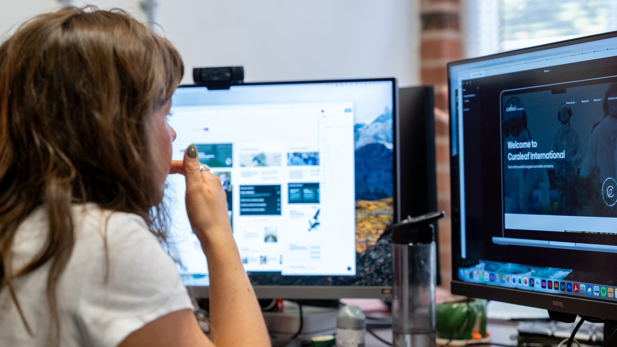
With a newly aligned brand, we applied it directly to a redesigned and custom-built website for the flagship brand, Curaleaf International.

We translated the typography, accessible colour palette, custom iconography, and brand messaging into a modern, sleek, and easy-to-navigate interface.

We engineered the site from the ground up to meet strict WCAG digital accessibility standards, including clear colour contrast, legible typography, and intuitive navigation for a diverse patient and user base.

Because the Curaleaf International site sits at the top of the corporate structure, we needed to make its entire operational footprint clear to visitors. To do that, we designed an interactive global directory map using the new Brand Book assets. This feature clearly breaks down each sub-brand’s location and purpose while linking directly to their respective websites.

Underneath, we custom-built the platform to support rapid load times, strict data privacy standards, and secure architecture, aligning with the high standards expected of a medical professional.

With the Brand Book and website rebuild complete, Curaleaf was positioned to roll out a cohesive brand identity across its portfolio, eliminating the risk of brand fragmentation.

Our Results

"The whole Unit team helped bring the refreshed Curaleaf brand to life - from supporting the development of brand guidelines to designing and launching the new website. They drew inspiration from our US peers, translating concepts into designs that feel both fresh and aligned. Their attention to detail and strong project management were crucial in delivering this project on time."
Beth Escott-Sweet Communications Director, Curaleaf International